Quick answer: Color is the photography element that has the biggest, fastest effect on the mood of an image. Warm colors (red, orange, yellow) feel energetic and inviting; cool colors (blue, green, purple) feel calm and distant. The easiest way to use color well is to keep your palette simple and pair colors that sit opposite each other on the color wheel — like blue and orange — so your subject pops.
Of all the elements of photography, color is the one your viewer reacts to before they’ve even worked out what they’re looking at. We feel color instantly. A sunset photo feels warm and romantic; a foggy blue morning feels quiet and lonely. That reaction happens in a split second, and it’s happening whether you planned it or not.
The good news is that you don’t need to be a painter to use color deliberately. A little bit of color theory — the same ideas designers and artists have used for centuries — goes a long way. This guide breaks down what you actually need to know as a photographer, without the art-school jargon.
Table of Content
Color Theory Basics for Photographers
Color theory sounds intimidating, but for photography it comes down to one tool: the color wheel. It arranges colors in a circle so you can see which ones are related and which ones clash. Three terms describe any color you’ll ever shoot:
Hue — the color itself (red, blue, green). This is what most people mean when they say “color.”
Saturation — how intense or pure the color is. High saturation looks vivid and punchy; low saturation looks muted and gentle.
Value (or lightness) — how light or dark the color is. A pale pink and a deep maroon are the same hue at different values.
Once you can see a scene in terms of those three things, you can start making choices — in the moment when you shoot, and later when you edit.
Warm vs. Cool Colors and the Moods They Set
The single most useful idea in color is the split between warm and cool. Warm colors advance toward the viewer and feel lively; cool colors recede and feel calm. Here’s how the common ones tend to read in a photograph:
| Color | Temperature | Mood it tends to convey |
|---|---|---|
| Red | Warm | Energy, passion, urgency, danger |
| Orange | Warm | Friendliness, warmth, comfort |
| Yellow | Warm | Happiness, optimism, attention |
| Green | Cool | Nature, calm, growth, balance |
| Blue | Cool | Calm, trust, distance, sadness |
| Purple | Cool | Luxury, mystery, creativity |
| Black & white | Neutral | Timelessness, drama, emotion |
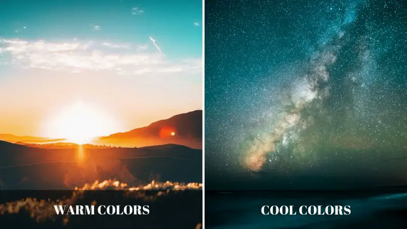
This is why sunrise and golden hour photos are so universally loved — that warm glow signals comfort and romance. It’s also why a moody portrait often leans blue. You’re not just recording a color; you’re setting an emotional temperature.
Color Harmonies (Color Schemes) That Work in Photos
A “color harmony” is just a reliable combination of colors that looks good together. You don’t always get to arrange your scene, but knowing these helps you spot a strong shot — and decide what to include or leave out of the frame. The four you’ll use most:
| Harmony | What it is | Effect |
|---|---|---|
| Complementary | Two colors opposite on the wheel (blue/orange, red/green, yellow/purple) | Maximum contrast and pop — the most popular look in modern photography |
| Analogous | Three colors next to each other (yellow, orange, red) | Calm, cohesive, natural — common in landscapes |
| Monochromatic | One hue in different shades and tints | Elegant, minimal, moody |
| Triadic | Three colors evenly spaced on the wheel | Vibrant and balanced, but busier — use sparingly |
If you remember just one of these, make it complementary. The blue-and-orange combination — a warm subject against a cool background, or vice versa — is everywhere in film and photography because it makes a subject leap off the screen. Next time you shoot a portrait at sunset, notice how warm skin against a cool blue sky does the work for you.
How to Actually Use Color When You Shoot
Theory is useful, but color lives or dies in the choices you make at the scene. A few habits that consistently produce stronger color photos:
Simplify your palette. The most common color mistake is too many competing colors. A photo with two or three colors almost always reads stronger than one with seven. Move your feet or change your angle to cut out the clutter.
Use one color as the subject. A single red door in a row of grey walls, one yellow taxi on a wet street — a pop of color in an otherwise muted scene creates instant emphasis.
Mind your white balance. White balance is your camera’s attempt to render colors accurately under different light. Set it to match your light source (or shoot in RAW so you can fix it later) to avoid photos that look too orange indoors or too blue in shade.
Shoot in the right light. Color looks richest in soft, warm light. Harsh midday sun washes colors out; the hour after sunrise and before sunset saturates everything beautifully.
Watch for natural complementary pairs. Green grass and a red jacket, a blue sky and golden sand — nature serves up complementary colors constantly once you start looking.
When to Take the Color Away: Black and White
Sometimes the boldest color choice is no color at all. Removing color strips a photo down to light, shadow, shape, and texture, which can make an image feel more timeless and emotional. Black and white works especially well when color is a distraction rather than the point — think dramatic portraits, street photography, and architecture.
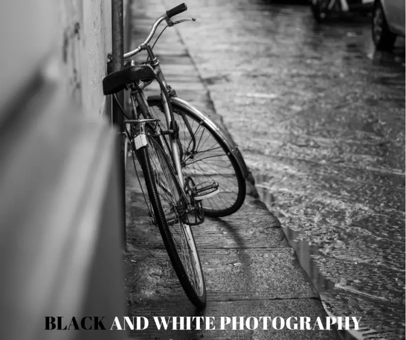
If you want to go deeper here, we have a full guide to black and white photography for beginners. The key takeaway: a scene that relies on color contrast (a red flower in green leaves) usually falls flat in black and white, while a scene built on light and texture often gets stronger.
Color Is One Piece of the Bigger Picture
Color is powerful, but it works alongside the other building blocks of a strong image. Once you’ve got a handle on it, it’s worth understanding how it interacts with line, texture, and the rest of the elements and principles of photography. Start noticing color everywhere — in films, in advertising, in great photos — and your own eye for it will sharpen fast.
Frequently Asked Questions
What is color theory in photography?
Color theory in photography is the practical understanding of how colors relate to each other and how they affect a viewer’s emotions. It’s built around the color wheel and covers ideas like warm vs. cool colors, complementary pairs, and color harmonies. Photographers use it to choose, combine, and emphasize colors so their images feel intentional rather than accidental.
What are complementary colors in photography?
Complementary colors are pairs that sit directly opposite each other on the color wheel — blue and orange, red and green, yellow and purple. When placed together in a photo, they create strong contrast that makes the subject stand out. Blue and orange is the most popular complementary combination in modern photography and film because warm subjects pop against cool backgrounds.
What is the difference between warm and cool colors?
Warm colors — red, orange, and yellow — feel energetic, inviting, and close, and they’re associated with sunlight and fire. Cool colors — blue, green, and purple — feel calm, distant, and serene, and they’re associated with water, sky, and shade. Warm colors tend to advance toward the viewer in an image, while cool colors tend to recede, which is useful for creating depth.
How do I make colors more vibrant in my photos?
Shoot in soft, warm light (early morning or late afternoon) rather than harsh midday sun, set an accurate white balance, and simplify your scene so a few colors dominate. A polarizing filter deepens blue skies and cuts glare for richer color outdoors. In editing, increase vibrance (which boosts muted colors gently) before reaching for saturation, which can quickly look unnatural.
Is color an element or a principle of photography?
Color is an element of photography — one of the visual building blocks you find in a scene, alongside line, shape, form, texture, pattern, and space. The principles of photography (balance, contrast, emphasis, and so on) are the rules you use to arrange those elements, including how you combine and balance colors within the frame.